Mike Rianda and Jeff Rowe's animated adventure puts the humanity back into apocalyptic animation.
From the outset, Mike Rianda’s idea for an animated feature was a creative risk. Rianda, who had never directed a feature film, wanted to tell the story of an artsy teen who’s forced to come together with her family to save the world. He wanted to keep it visually unpolished, messy, raw. And, above all, he wanted the story to bridge divides and connect families. When the script was first produced at Sony Pictures Animation and later picked up by Netflix — both of whom had confidence in the fresh visual world Rianda had created — The Mitchells vs. The Machines became, as Rianda puts it, “a real boy.”
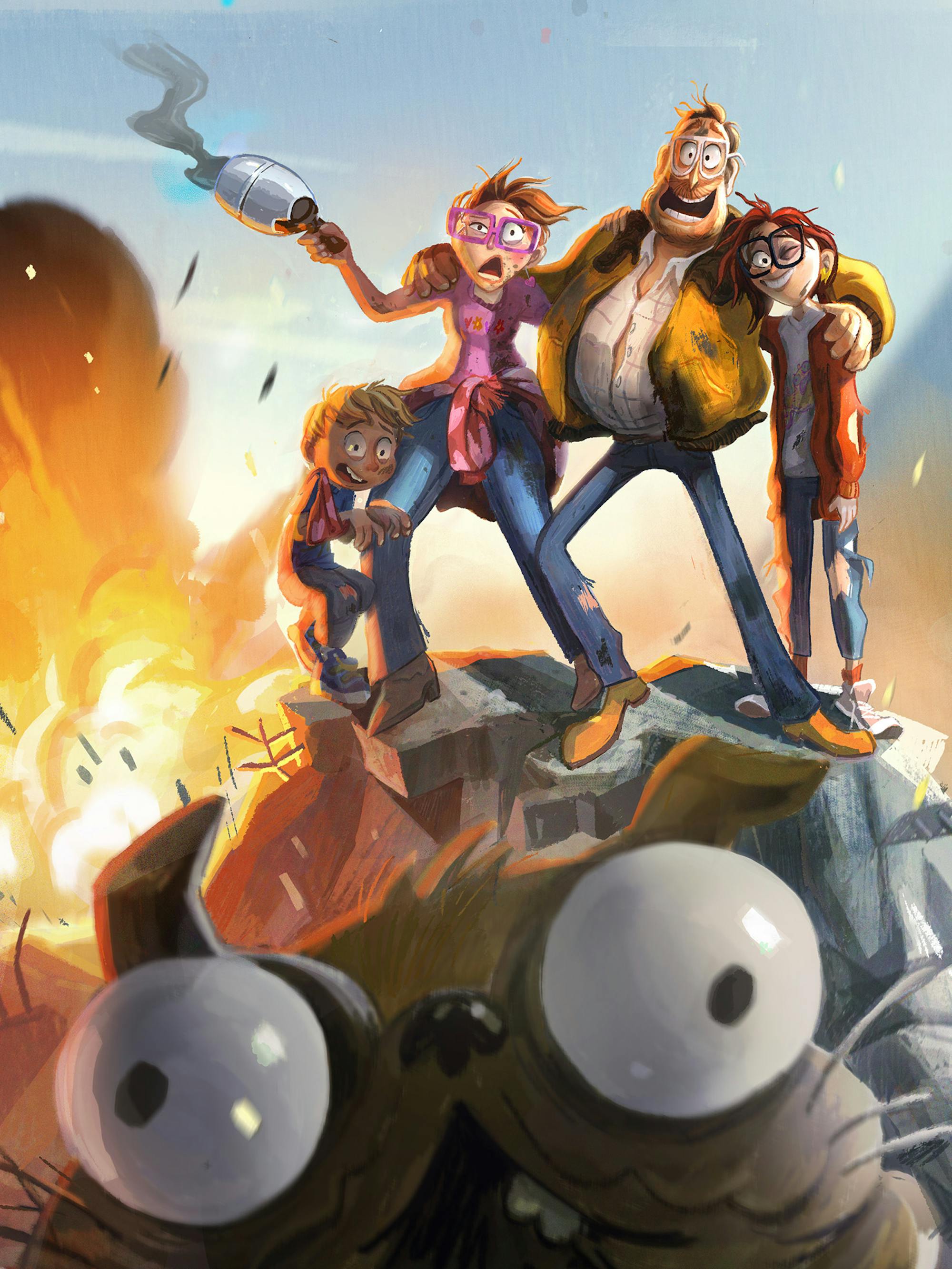
Mike Rianda and Jeff Rowe, former writers and creative directors of Disney Channel’s popular series Gravity Falls brought together a small, but talented team of animators and storytellers to develop and design The Mitchells vs. The Machines. The film centers on a regular family from Michigan who, on their way to drop off their daughter Katie at college, must thwart an apocalyptic tech uprising led by a smartphone and confront some major father-daughter issues. Giant toys, a kitschy dinosaur shop, goofy robots, and a hilarious younger brother become entangled in the rebellion, and a delightfully chubby pug ends up playing a big role in saving human civilization as we know it.
What’s unique about The Mitchells vs. The Machines is the authenticity of the Mitchells and the way that the family’s quirks, and even failures, are captured so lovingly. The film reflects how real people live — with their messy hair, disorganized rooms, and worn-in clothes and furnishings — and beautifully contrasts these human conditions with the symmetrical, hypoallergenic, and pristine world of the robot universe. Electrifying visuals underscore these differences, along with the The Mitchells vs. The Machines’ message that humanity, with all its flaws, will triumph over electronic perfection.
The Art of The Mitchells vs. The Machines, published by Abrams, details the journey of Rianda and Rowe’s film from concept, through visual development and exploration, to its final, one-of-a-kind style. Originally written by Ramin Zahed, what follows are edited excerpts from the book.

Linda (Maya Rudolph), Aaron (Mike Rianda), Rick (Danny McBride), and Katie (Abbi Jacobson)
Rianda and Rowe knew that they wanted the movie to have a certain visual intimacy that was missing from the average C.G.-animated studio projects of recent years. “The visuals of the movie were very important to us,” says Rianda. “Big studio animated movies are often so beautiful. But people get accustomed to seeing the same kind of beautiful animation over and over again — they become numb to it. We were thinking that if we ever got to do our own movie, we would have the chance to do things a little bit differently.”
“Our production designer, Lindsey Olivares, came up with these amazing early drawings for the movie, and we thought, ‘Wow, what if the movie looked exactly like your drawings?’ When you look at many of these beautiful ‘art of ’ movie books, you think, why didn’t the whole movie look like these drawings? So we decided to go for that.” The movie’s visual effects supervisor, Mike Lasker, “totally geeked out on this idea,” the director recalls. “He was able to do this incredible job of making the visuals mirror the story.”
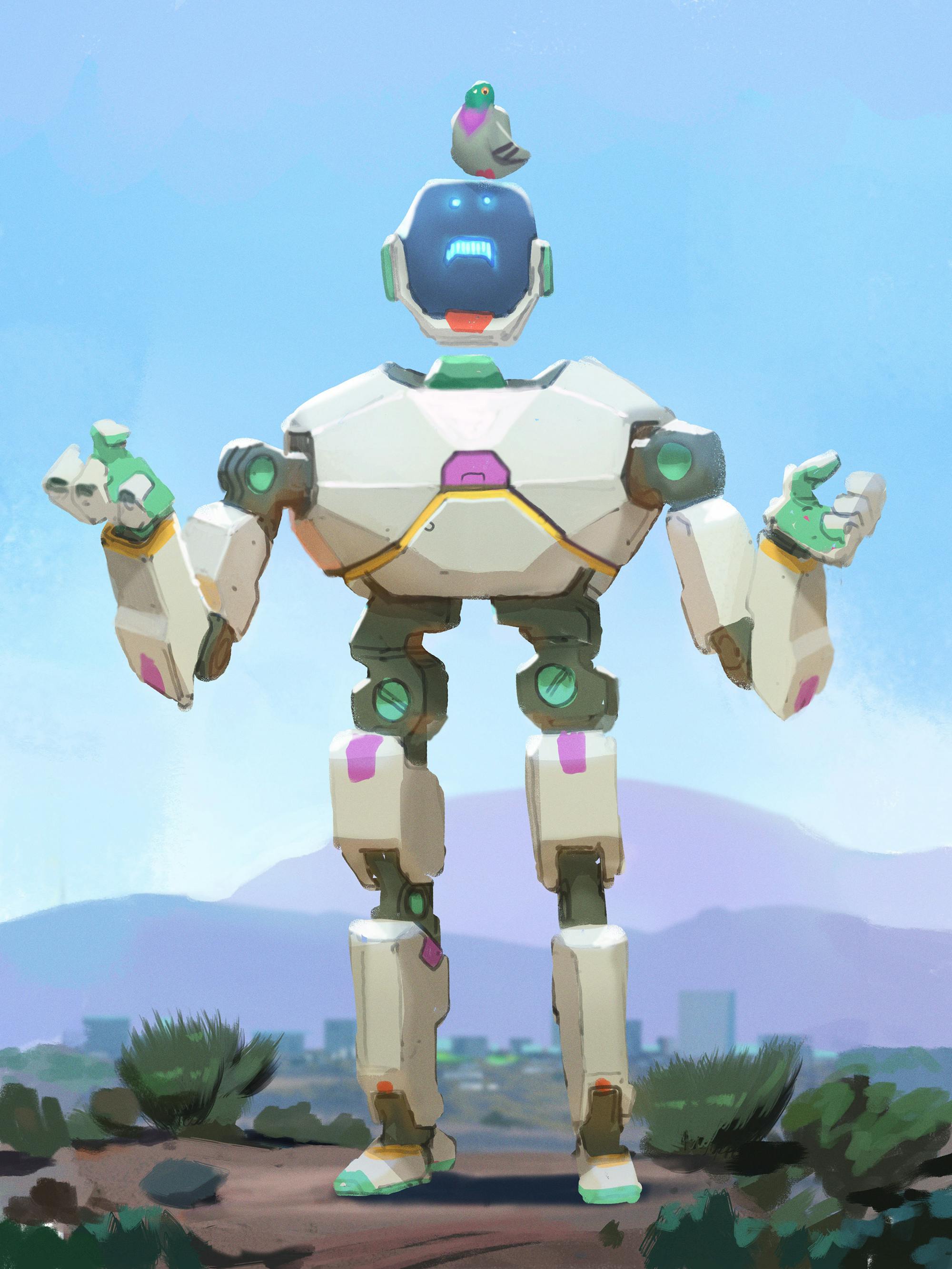
To properly tell the Mitchells’ story, the visual style of the film needed to both characterize the family and set them in stark contrast to their foes: the toasters, smart phones, and robots with dreams of world domination. Against the lived-in, messy world of the Mitchells, the robots inhabit a pristine futuristic world that is all about straight lines and perfection. As co-director Jeff Rowe recalls, the robots’ section of the movie is influenced by the work of celebrated American artist James Turrell, who uses light as his medium, as well as the work of one of the movie’s talented artists, Arthur Fong.
“We kept toying with the idea to make the robots look different, but the truth is that they had to look like a consumer product we were familiar with,” says director Michael Rianda. “If a big company were introducing robots, they would try and make them look as friendly as possible, not threatening, sinister, or crazy.” However, if the machines were designing robots, they wouldn’t care about the friendliness quotient at all. “All they’d care about is brutal efficiency,” says Rianda. “This is why all the locations for the machines are simple and polygonal, with no rough edges. A machine wouldn’t have the same aesthetic sense as we do, so it wouldn’t have to worry about how to make things accessible, warm, and human-friendly. Everything would be clean, sheer, and sparse so that nothing would be wasted.”
With Rianda’s initial plot outlines in hand, The Mitchells vs. The Machines team worked together in unconventional ways to shape the emotional arc of the film and conjure up the details that brought the story to life. “When we first got the team together, it was a very small group,” the director recalls. “We were kind of like The Bad News Bears, and many of us were doing a movie project for the first time.” First-time feature producer Kurt Albrecht (The Proud Family, Hotel Transylvania) watched a group of relative newcomers step up to create one one of the most memorable films of the year: “Mike and Jeff come from the world of 2D TV animation, and our production designer Lindsey Olivares and head of story Guillermo Martinez had never worked in leadership positions on a movie before this one,” he points out. “There’s a lot of new blood in this movie, and they’re constantly coming up with new ideas, plussing the film, and adding new jokes.”
To get the details of the Mitchells’ car trek across America right, Rianda, Rowe, and some key members of the art and design team planned a road trip themselves — without cell phones. “As soon as we put our phones in a bag, we started having really great intimate conversations. It was funny how we started connecting immediately as soon as the technology went away!” The team also mined their own memories of what it was like to be a creative teenager who dreams of going to art school, despite their families’ wishes for a more stable and conventional profession than artist or animator, to create a family dynamic with depth.
The director laughs when he thinks about all the different twists and turns the movie has taken over the past six years. “In the beginning, we had some funny jokes but we lacked an emotional center. The core relationship between Rick and Katie came from the process of rewriting. As we made the movie more emotional, it got better, and the jokes became funnier because the audience cares about the family.”

The Mitchells vs. The Machines team reached for the stars. “We all believe that for a movie to stand out, it has to be something people have never seen before,” says Rianda. “We asked ourselves three questions: Is it boring? Is it confusing? Is it the greatest movie of all time? I know that sounds like a crazy goal, but if you’re not aiming high, then you won’t even get close.” The team’s risks paid off; the film’s visuals are both whimsical and striking, and the characters as true as our own family members.
Rianda says he’s proud of the fact that The Mitchells vs. The Machines is able to tell a contemporary story about a family that feels very real. “I love the specificity of the Mitchells and the fact that they are not perfect like many of the families we are used to seeing in big studio movies,” he notes. “I hope that when people see our movie, it can bring families closer, both by watching it together and hopefully even after they leave the theater.”
Rianda’s dream is for audiences to laugh out loud and for his story to have a lasting impact: “It would be amazing if we could inspire a parent to try harder to understand their kids, or maybe get a kid to appreciate their mom or dad and try a little harder to give them a break. Families can be hard, but they’re worth fighting for. If we can get that idea across to people, while also including insane jokes about screaming siamang monkeys, gigantic Furbys, and talking burgers that get brutally eaten by pugs, then we’ve done our job.”

Aaron (Mike Rianda), Linda (Maya Rudolph), Rick (Danny McBride), and Katie (Abbi Jacobson)


